
Brand identity
Self-initiated concept. Not client work. The brand is invented.
Deep End is a concept for a swimming school for adults: an identity built from the depth markers printed on the tiles at the edge of a pool.
Concept
An identity for a swimming school for adults who never learned
What it is. An exercise we set ourselves: a name, a mark, a system and the things it would be printed on. Nobody commissioned it.
- Boards
- 7
- Courses
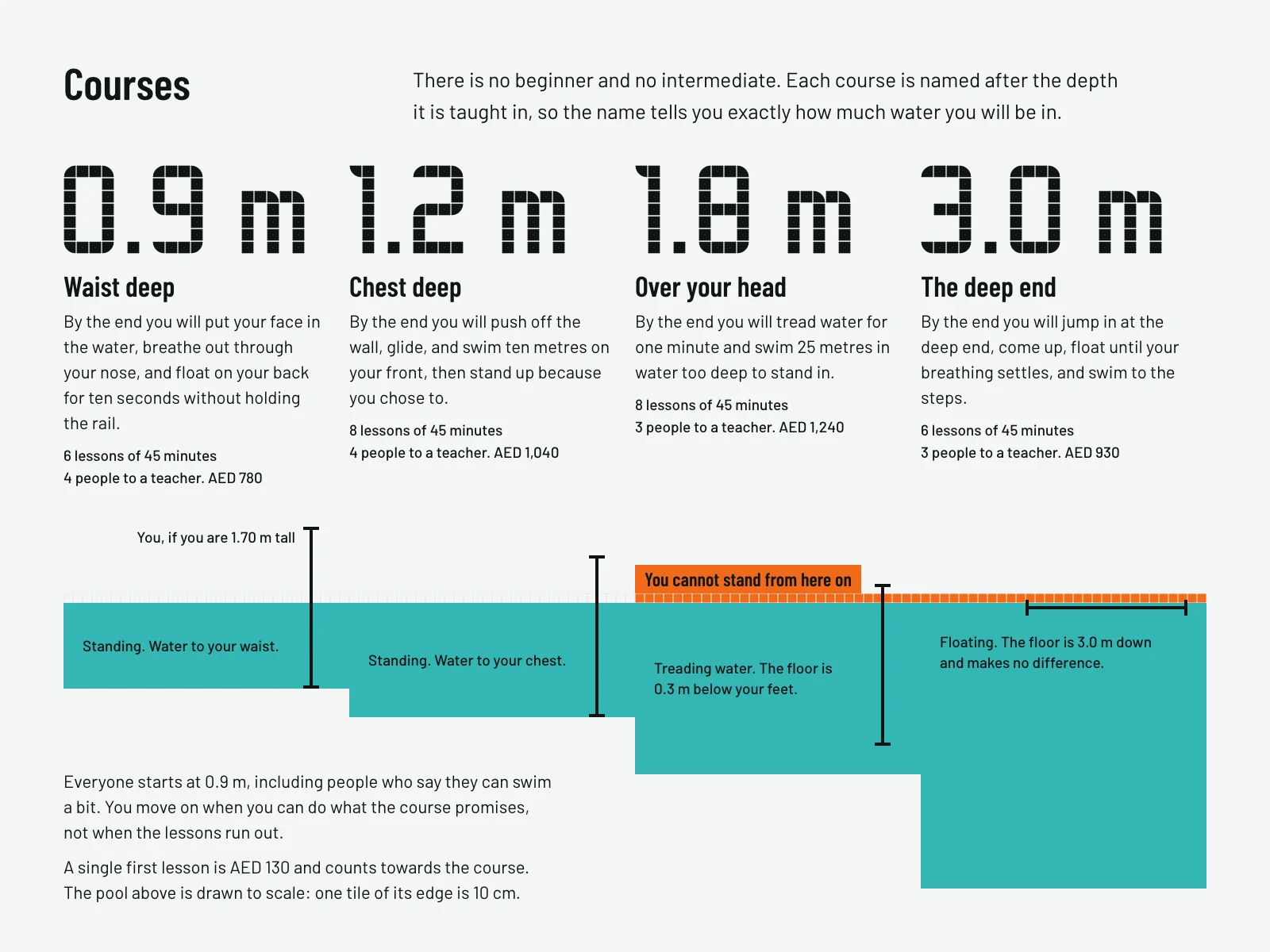
- 4, named by depth
- Typefaces
- Barlow Condensed, Barlow
- Colours
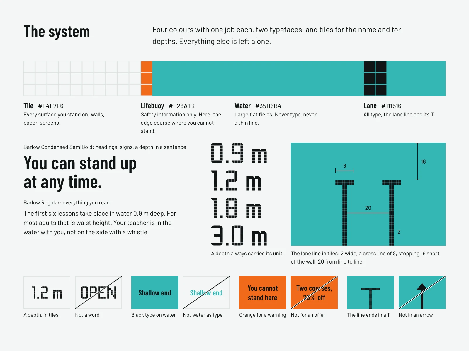
- Tile, water, lane, lifebuoy
- Idea
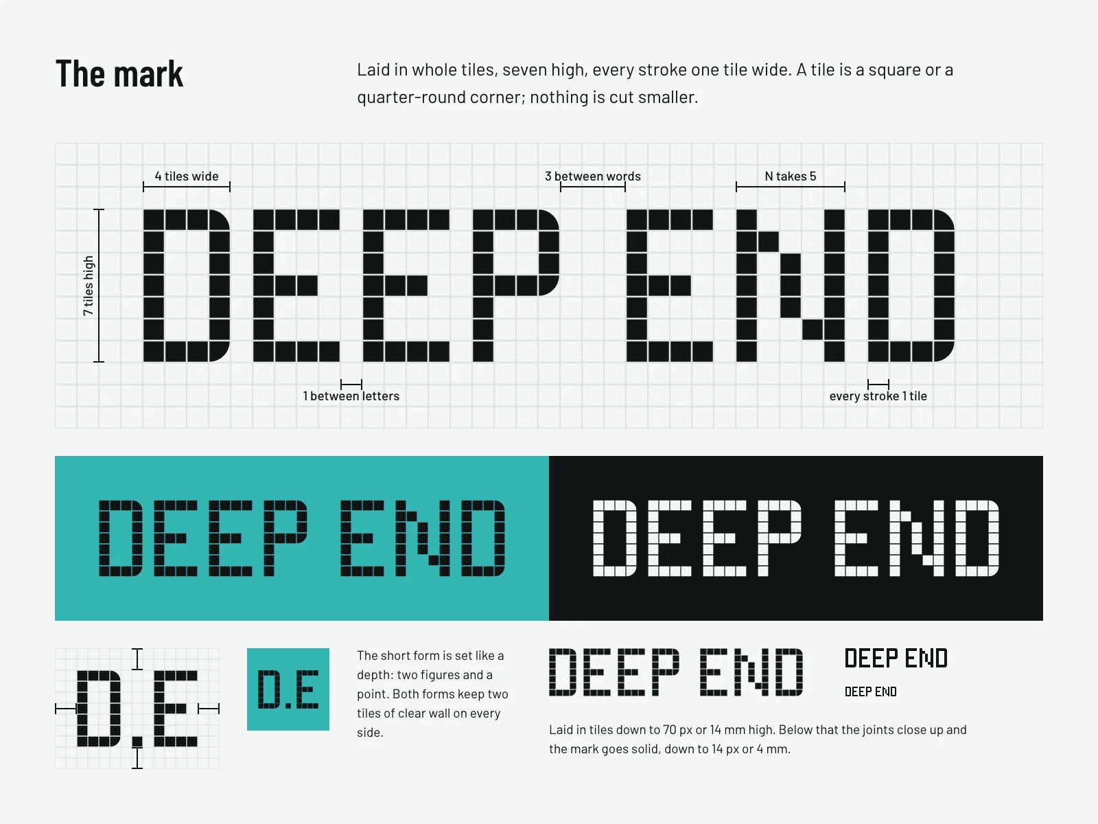
- The depth marker is the brand
The idea
Many adults cannot swim and are embarrassed to say so. Swim schools talk to children, with cartoon fish, or to athletes, with split times.
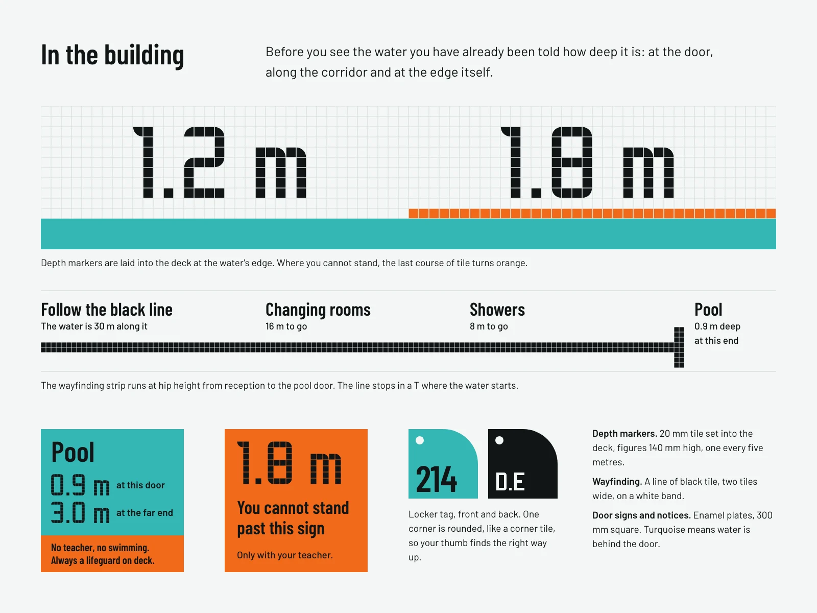
This invented school talks to a nervous forty-year-old. Its identity comes from the pool itself: the square tiles, the depth printed at the edge, the black lane line on the floor and the T where a lane ends.
Courses are named by depth, not by level. 0.9 m is waist deep and 3.0 m is the deep end, so the name tells you exactly how much water you will be in.
The mark
The system
Courses named by depth
In the building
In print and on a phone
-
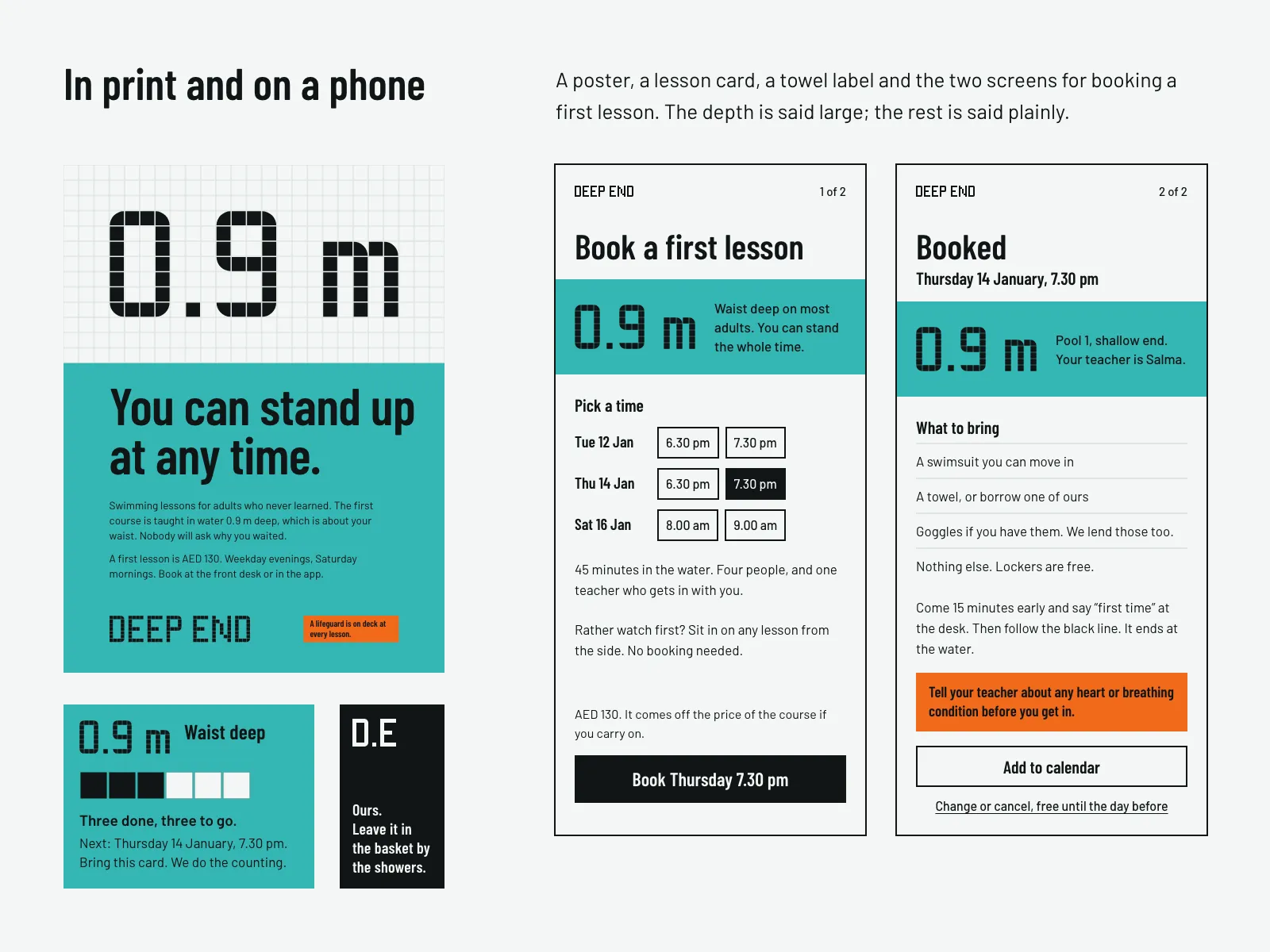
A lesson card, a towel label and booking a first lesson. -
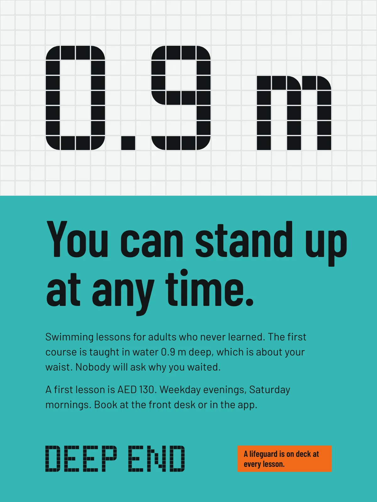
The poster.


The voice
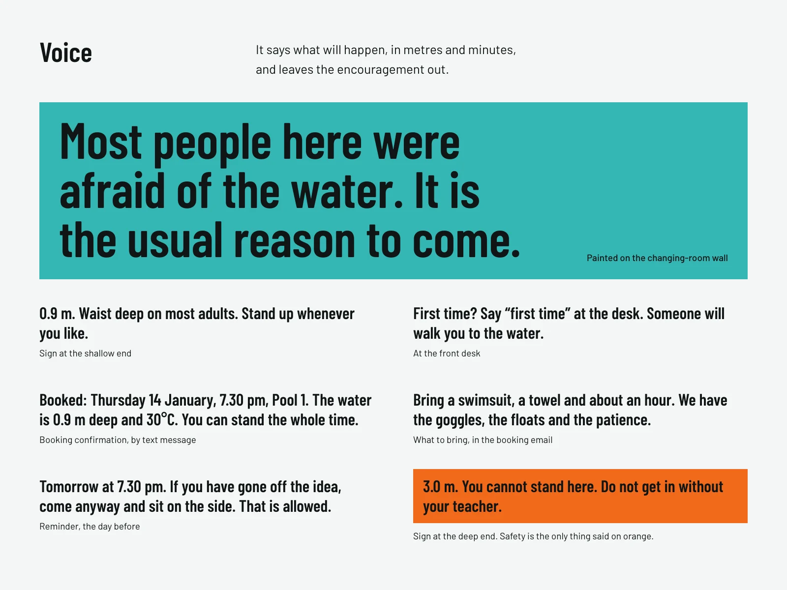
Colour and type
- Tile #F4F7F6 Every surface you stand on
- Water #35B6B4 Large flat fields, never type
- Lane #111516 All type, the lane line and its T
- Lifebuoy #F26A1B Safety information only
Barlow Condensed and Barlow. Condensed for headings and signs, regular for reading. The name and the depths are not set in a typeface at all: they are laid in tiles. Barlow is by Jeremy Tribby, under the SIL Open Font License.
What this is
A concept: an exercise we set ourselves. Deep End is an invented brand, nobody commissioned this, and it has not been built or launched. Any likeness to a real company is unintended.